Tuesday, December 6, 2011

Favourites & Reblogs

I've done a lot of work I like this semester, but to pick a favourite I think my latest work for Illustration concepts which is my sexy sumo Pisces man.


For this assignment I decided to take the played out 'sexy horoscope ladies" and replace the character with something completely different. I like the colours I used and my idea quite a bit.


For my favourite post, I think this liquid type posted by Nina may just be my favourite.
It's creepy and interesting and dynamic and I think it's a really cool way to use animated gifs as a medium.
I'd love to see a music video or movie titles done this way!!

Thanks for a super semester everyone!
Nicolle :)

REBLOG : Thanks you Nicolle :)

OCAD COMDES1 Section 14: REBLOG : Thanks you Nicolle :): "Iconatomy" by George Chamoun George Chamoun's collages are a amazingly seamless blend of two different people, from two different eras...

Fav Work


Favourite work done by me this semester...

The reason for this work being my favourite is because It gave me an experience I was unfamiliar with. I was given an assigned task to recreate the full logo for all of Print and Graphic Depot's branding, and i really enjoyed working on it. I learned the experience of what it is like to create things like letterheads, business cards, etc for a client. I also enjoyed coming up with the concept of the whole thing because the logo was suppose to be conceptual and i believe my logo worked really well. If you pay attention to the colour differences there is a P and a D with in an ampersand all in one. Which stands for Print & Design as you can see to the right, where there is hierarchy in type as well because you notice graphic is smaller, and less important of a word. Works well i think...

Favourite Work

My very favourite works were done in this class...so I was a little difficult to decided what to choose but I decided on this:


The purpose of this poster was to take a song, pair it with a piece of fine art, and then use the lyrics of the song to create a poster. I did one of my favourite songs "White Nights" by Oh Land which currently has 6388 plays on my iTunes (...literally.)  So doing this piece gave me a chance to express through design my love for this song.

Reblog of Catters Collage


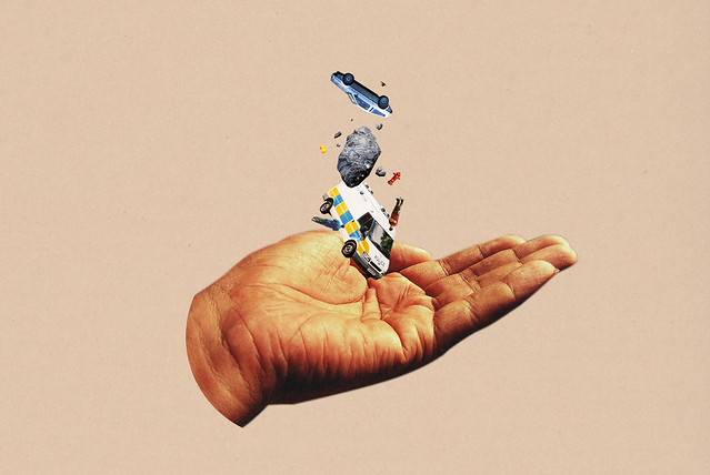
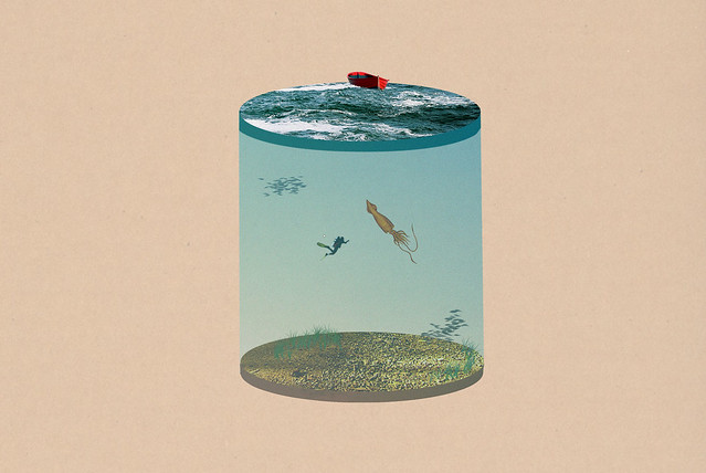
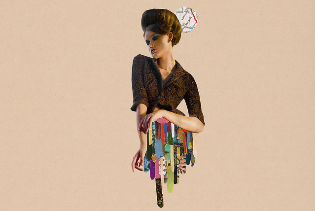
These collage pieces are quite frankly some of the best ones I've ever seen! Until Nina posted this I never really thought of a college being used in this way. The conceptual work done in these pieces are just FANTASTIC!! "Skyrock" and "LifeCylinder" are particular favourites of mine, they're just so whimsy! 

Thank you Nina for sharing :)

-Jayan


My grade 9 English teacher condemned my class from ever handing a collage in for a creative assignment, and for some reason ever since I've never thought of how collages could look beyond the teenage binder, Seventeen magazine...sort of thing (Not to bite :(, but I mean something like this). Obviously Ms. Wittlin had never seen collages past those kinds, as well.

I was looking around Flickr for collages for this weeks' post, and that's when I found Guy Catling (catters on flickr). He's not famous or anything I don't think, but more the reason to share his stuff =D


power

lifecylinder

skyrox

handofgod

I like his collages because they're simple, and are able to convey some sort of message without being so inyourface. The collage power was really awesome to me (plus I can't help but giggle at that little rubber ducky--can you see it?), and the pieces like handofgod and skyrox remind me how small we all are in this world... but almost in a reassuring way. If that can make sense to you.

And this one above gave me an idea for my own collage :D

Best
Nina

REBLOG: All About Aesthetics from Rennie

So I chose to reblog Rennie's post because of the concept the post shows. Before deciding on graphic design, I was really considering interior design/decorating, so seeing designs like this really inspire and intrigue me. I live in a small condo with my parents and I've always wanted to do something really rad like this to save space in my room and make it look more modern and chic. It also reminded me of other space saving bedroom designs I've seen on tumblr. It is interesting to search up different ways designers have come up with space savers. They can really add to a room and I feel as though it would really help a design student, such as myself, think clearly and more creatively when working in its space. For example:


Hey everyone!


Sorry for the late post. I'm studying graphic design, but I also appreciate all aspects of art & design. What inspires me most are DIY projects and industrial design. I just moved into a little box above a store in china town, and it's REALLY tiny! My personal project since then has been retrofitting and redesigning my new home to be space-smart. I decided to vamp for a loft bed. Here are some designs that are inspiring to me:


here are some other inspirational interior design links:
apartment therapy & ikea hacks

I am also obsessed with packaging design, it's what I hope to major in!
that's it for now.. but if my post wasn't quite your niche, here's an interesting site (wilderness downtown) you definitely want to try out!

- Rennie

Monday, December 5, 2011

Favourite Work


So far this year one of my favourite pieces was this one. It was a project for colour in context, even though it doesn't really have any colour in it. For this we had to re create a piece from a fashion magazine as an illustration using line. Instead of complicating the image with too many lines i just simplified it down to the basic gesture of what the picture was.

The reason this would be my favourite piece for this year so far would be because i was genuinely happy with how it turned out. Sometimes even though i get a decent mark on something it really never turned out the way i wanted it too but for this piece it did. I was criticized for it being too simple but thats just the way i like to do things. I like keeping things simple and this turned out exactly like that.


Ryan :)

REBLOG : Thanks you Nicolle :)

"Iconatomy" by George Chamoun


George Chamoun's collages are a amazingly seamless blend of two different people, from two different eras, and I feel really expose that we find to be "iconic" in a celebrities features. No morphing has been involved in these, only careful selection and cut and paste. It's a simple, interesting concept but I think it's quite eye catching and effective - I guess what we find to be appealing never really changes, does it?

My reblog is from Nicolle! I saw this and thought it was freakin awesome! I love how eye catching it is, at first the composition of the two images looks like one person or "icon" but as you look closer you realize thats its actually two different people, from two different eras. The idea behind this art is really simple, and it appears to be true that what we find attractive in celebrities stays pretty much the same throughout time. I simply love the idea behind this and the mixing of the black and white for past celebs and the colour for the ones in present really make the piece pop!
Im really glad this was posted because its something that i probably wouldn't have noticed otherwise. I love the mixing of old and new and this is a really cool take on celebrities, pop culture and icons.

Thanks Nicolle!

Favourite Work


This piece is from my Colour in Context class. We were required to create a regional collage about our birthplace using common colours we found in our own photographs. This collage is about Toronto and I used red, blue, and green as my colours. What I love about this piece of work is that I had the opportunity to use old photographs I took myself in high school. This is probably the most abstract piece of work I have ever created so I was really happy and surprised at how it turned out. The limit on colours forced me to really play with the more abstract characteristics of collages and it also helped me develop my whole idea for this project - that Toronto is a very diverse city and has the best of both worlds with its cityscape and more urban modernization coexisting with nature. That notion led me to the idea of placing rectangular shapes (flat shapes were another requirement) amongst the rocks to represent buildings amongst nature.

REBLOG: COLLAGE

The reblog below is a post by Laura Goodyear. This post really caught my eye as it is vintage in style and equally trendy. It's definitely something I can see myself framing and hanging on my wall.

The fact that all the images are found and true in a realistic form, added more interest along with depth and stories behind these pieces.

-Nata DiBartolomeo 


Nostalgia

Hey Guys!
I found this lovely collage artist on Etsy for you all...
Her name is Michelle Caplan.  She uses found images and materials from everywhere..
Old photos, wrapping paper, notes, old books...anything!
I love that her work has a history...that every piece has been used before...yet, they can still come together to create something pretty lovely...
http://www.michellecaplan.com/


Best work of Semester


This piece was done for the colour and context class. It was an emotion representation where we had to paint and digitally place the emotion within the art work. I chose this particular one because I am definitely not accustomed to paint as this was a challenge for me. Yes, I admire people who paint however when it comes to my painting skills I don't have the patience for it.

Colour is something that I like and can play around with however in different mediums.

The piece I believe did convey confusion as the theme is depicted in an ocean setting. It shows the boat in the air and the many fish swimming in the sky only to go in many directions. The word "confusion" was strategically placed to portray this projects objectives.

Nata DiBartolomeo

Favourite Piece

Hey! This is a piece I did for a drawing class, it was a head study in conte and pencil crayon. It was inspired by the movie Marie Antoinette. The scenes are filled with the most decadent pastel colour palette and I just loved it. This is my favourite piece of the semester because I enjoyed creating it the most...I got to draw my favourite thing....a face!

FAVOURITE ASSIGNMENT = TEDDY BEARS


So this is my teddy bear army. Joking~ This is one of my favourite assignments. For my colour class we were told to make a t-shirt design and me being who I am could not decide so I decided to draw whatever came to mind. I ended up producing and image of a teddy bear and decided to keep it simple.

below are my other teddys the two bears with the brown around it were just for fun =D

and the four below are ( left to right)
colours i hate
colours i like
achromatic
monochromatic


I really like this project it's been fun ~
Hopefully we all have a wonderful winter semester/term too =D
Wish you all the best of luck! and maybe you'll be in my future classes =D


-Toodles~

-Stacey

OCAD COMDES1 Section 14: Superflat Monogram

OCAD COMDES1 Section 14: Superflat Monogram: So here's my favourite "ad" for all you guys to see :) It is for the company Louis Vuitton, and the reason I say "ad" is because its more of a short film, clocking in at around 5 mins. I'm not going to give a synopsis since on paper it sounds really bizarre. :p Just give it a watch and I'm sure you'll enjoy it!

However, what makes this ad interesting is the craziness that is everywhere, and the fact that, besides the Louis Vuitton logo being practically plastered everywhere, no actual products are shown.

I think this is because Louis Vuitton has branded itself as more of a culture over the 150+ years of its existence, and they consider shopping at their stores more of an experience. So this ad its to sell the experience and not the products.

The style of the drawing in this ad is called "Superflat" which is an 2D art movement to show the shallowness of the consumer world, so the fact that Louis Vuitton has used this is kind of funny, since by using it they are poking fun at themselves.

Hope this was of some interest to you guys. :)

Posted by :Jayan


------------------
I really liked this post, after watching this a couple of time I even looked up the artist. It's colourful and it's has repetitive logos shown everywhere, but it's this cute weird adventurous ad. I think it's the music and the adventurous nature in the ad that draws me to it. This was one of the many posts that stuck in my mind after seeing it.

Thanks for sharing this with everyone =D
-Stacey

favourite

This is expressive letter i picked for this blog topic
and this is actually on of my work i did it on Typography class
Migration- to move from one country or region and settle in another.
So i made it that it flows and letters are moving toward other place.

Re: Re-Blog

OCAD COMDES1 Section 14: Staying Creative.: Hello ! I find this video absolutely amazing. Since this most of our first years at O C A D U , I thought this video may be of some help...

This video really opened my mind to the creative ways of using design principles learned in class alongside animation. Ever since this video was introduced to me, I basically learned different ways to stylize my work whether it be in this class or others. Not only is this video effective when it comes to design, but it also points out key elements to survive in our OCAD life and ..out-side-of-school life? .

OCAD COMDES1 Section 14: bubble gum!!

OCAD COMDES1 Section 14: bubble gum!!: i loveeee bubble gum art. i think this counts as a form of collage because it it made up of many different types of gum. I am looking into experimenting with this medium. I think it really adds "POP " side of these works of art.

This reminds me of works by visual artist Vic Muniz who makes interesting art from a wide variety of materials including sugar, wire, thread, and Bosco Chocolate Syrup. This particular piece was composed entirely of toy soldiers. I like his various choice of materials used to recreate these images.

Best Project: Illustrative Concepts: Astrology

After looking through the numerous project assigned through out the semester, I'd have to say this airbrush piece I made was most effective. Basically the class was told to take a zodiac, and represent it in anyway they wanted to. My idea was that zodiacs were always represented with a mystical or magical style, and I thought of how to basically cut it down to its bare minimum. So I chose to do Pisces, which is represented by a taxidermy fish. I wanted it to relate to anyone in the class, and it did. Many people related it to their grandparents houses or their cottage up North. I also loved the fact I could take my medium of major practice, and put it to use and open many peoples eyes to the craft of airbrushing, something that isn't really practiced in comparison to traditional mediums.

my favourite

This is on of my favourite piece design i did, this is from drawing class, and
i really like how its really colourful, and enjoying doing this. and i picked
yoyoma's impressions album. i really like how the background abstract the
portrait. !

favourite artwork this semester


One of my favourite pieces from this semester was one I did for my Illustrative Concepts class. The goal was to create an object that exuded an emotion or mood. I chose "serene" and tried to create a stable, steady, and horizontal figure. I also positioned it a little lower on page because I associate serenity with being more grounded but not so low on the page that it would seem sad. Relating to my reblog post, I used the Colour in Motion website to help with colour choice. Blue and green had calm qualities so I incorporated both in much more subtle tones.

I consider this to be one of my best pieces this semester because my classmates found it to be quite effective and it translated really well. In my opinion, the best pieces are one's that don't need to have an explanation.

Amanda

Reblog: "Colour in Motion"


"I was trying to find something that really had a good representation of colour for this weeks blog entry, and while I was on stumble upon I found this website http://www.mariaclaudiacortes.com/

Its an interactive colour website that provides the basics on the primary and secondary colours. each colours complimentary colour is stated along with what the colour represents in different countries around the world , and some of its positive and negative traits (the mood the colour can emulate). Another cool feature i found about this is it could be really useful for projects while looking up certain colours to use in a poster. Its made into an interactive website that I thought was really fun, The movie clips about each colour were also really humorous to watch. This site was really cool and got me interactive and playing around with the site, with I thought was a really good component to this site. It uses simplicity and colour, mixed with a little animation to give all the basic information on the 6 main primary and secondary colours.

Here are some screen shots of the website, but I totally encourage all of you to play around on the website!

Ryan :) "


(Sorry I couldn't include the screenshots! Not sure why the photos aren't appearing on the blog anymore.)

I really enjoyed the website Ryan shared with us. It had a really great design quality, it was interactive, and I even learned a few things from exploring the site. I also found the characters to be quite charming and the music choices were very suiting. What I loved most about this site was that it became helpful to me in one or two assignments this semester! It really helped with colour choice regaring mood and tone. Thanks Ryan!


Amanda

Sweeny Todd Re-post

One post that caught my attention was Hendrix's Sweeny Todd expressive type post. I'm very familiar with the lyrics on the first poster as my friend sang it every day for a very long time, so it caught my eye right away. These posters illustrate that crude, bloody atmosphere and make the viewer feel the dirt and grime of London from the play. How the type follows the ink splatters and the drips send chills down your back the very way the play does as does the cold, hard contrasts of black and white or black and red. Overall, each poster conveys the mood of the play, every dark, twisted, murderous aspect of it.


This is my favourite piece from this semester that I drew for my Illustrative Concepts class. The project was to create a montage piece from one of the given famous speeches and I chose the speech about life advice. Sorry about the quality, I didn't have a large enough scanner to scan it into my computer and I had only taken a quick picture before I handed it in and now it is in the possession of family members who always fight over who gets my art. Anyways, this is my favourite (possibly because it earned my highest mark of the semester).


Sunday, December 4, 2011

Favourite Piece This Semester

Though very simple, I chose my first painting in colour in context as my favourite piece this semester. I had to create a achromatic composition using dot, line, and plane as our subjects and create depth/overlap. I mainly chose this piece because this was my first painting i've ever done and I was pretty proud of myself with the outcome. I also found a new passion for painting!


(I apologize for the bad quality picture)

- Jacklyn Bonsignore

Saturday, December 3, 2011

Typographic Poster

One of my best work this semester is the creation of a typographic poster using the words "You cannot not communicate". By using tracking, kerning and leading, I was able to manipulate typography and explore positive and negative space. The end result was an effective concept used to communicate a fundamental idea.


Friday, December 2, 2011

Best piece this semester?? ( at least in my opinion!)


Hey everyone! Throughout this semester I've had the chance to create a number of interesting and unique illustration pieces. Some turned out good but I'd say the rest were fairly decent :O
The favorite piece that I chose was from the Colour in Context course and the assignment was for us to study a specific artist and imitate the style of his/her works. My artist that I researched on was Frank Stella and he was well known for the movement of minimalism, abstract expressionism and also the merging of sculptures, installation and pop art altogether.

We were assigned to create a butterfly image according to the artist's specific choice of color, art style, medium, techniques etc. I think that this assignment gave me a lot of insight in an artist's inspiration and what motivates them to create such beautiful creative pieces. The whole process was memorable and in the end I think this product turned out to be the more successful, and the one I liked the most.

( My new and final google doodle will be posted up shortly, sorry I wasnt sure if I was supposed to post this blog here or the old one!)

Enjoy!


Hendrix


Thursday, December 1, 2011

Nostalgia/Childhood

Uuumm, so I don't know which work I've created this semester I'd consider my 'best' piece, but something I made that I definitely like was this collage for Colour in Context:


It was shortly after our book cover design assignment, so for one, I was pretty satisfied with this piece because I felt it was a much more successful attempt at collage. We were to pick a region/city that was personal to us, so I chose downtown Toronto, specifically a neighbourhood near Queens Quay W. where I spent a memorable chunk of my childhood, and used old family photos from then :-)

I think what I'm the most excited about when it comes to life is just life itself, and the whole experience of it... so what I find interesting to do is create works that are nostalgic and playful. Soo I guess what I like best about this collage is that it's personal--which def made this assignment more enjoyable. Plus I'm used to working digitally, so this was a nice chance to experiment more with working by analog.

When it came to critique, some people including the professor didn't get some details (ex: they thought the 3-dimensional texture at the bottom was just poor application D':), but I'm pretty content with it :D

Nina

Reblog: Deception

A post I really enjoyed was Maria's of a TED Talk by Marco Tempest.


I'm ever-impressed by how creative and clever people can get with presentations, and this is a perfect example. To start, Marco Tempest is a good storyteller, and offers really interesting thoughts on how we can perceive deception. His use of techie props and a little 'magic', however, was what made this TED Talk really engaging and inspiring for me.

Hurray!
Nina

No need to re-re-post so.... a little something new

My favorite post this year was Nicolle's collage post, it was both visually appealing and psychologically fascinating. It was uncanny to see that our beauty icons are so similar despite the time span and I challenge George Chamoun to go even further back to artifacts such as the bust of Nefertiti, who I think could also be paralleled to modern icons.

Well a post just doesn't feel complete without a visual so I thought I'd add a little something new, possible inspiration for my next flash undertaking :) It may be a little ambitious but I just love these credits, so enjoy.

Wednesday, November 30, 2011

Video REBLOG

Amanda's OCAD COMDES1 Section 14: Supakitch & Koralie — "something I love" post: SUPAKITCH & KORALIE - VÄRLDSKULTUR MUSEET GÖTEBORG from elr°y on Vimeo .


This video has been added to my favourites list. I think I've rewatched it about 15 x- yet it still never gets boring. I love it because its so aesthetically pleasing, i mean the overall outcome of the little details that it takes to create it. There's a relation to culture- mixed with contemporary styles, using organic lines with bright yet eye-catching colors- to create the movement, kinda art nouveau too. I'm a huge fan of detail oriented art- over an abundance of detail is exciting- especially all that line work. Its like omg- what are they doing- whats it going to look like when they're done- its the wait of the final product.


-VERONICA

Tuesday, November 29, 2011

Yes&No - Reblog

http://comdes114.blogspot.com/2011/10/yes-no.html

I really liked the typographical sculpture Amanda posted a few weeks ago - the one that reads "Yes" in one point of view and "No" in another.  The idea behind it is fantastic and so literal, it's genius.  Simple and effective.

For this reason, I've been thinking about it a lot.

I love sculpture and respect typography.  To see it combined in this play of 2D and 3D space is really, really cool.

This blog was nice because it really helped us all to see things we wouldn't have come across by ourselves.  All our different interests and hobbies came together here.  We got to see art from the eyes of 20 or so other people and it was valuable.  Sometimes it's good to see things outside of your own mind.

Adios, blog.

Leanna.

First Semester's Favourite

Sorry for the quality - this is a picture I took with my computer's web cam so I could show a friend.  The actual piece is with my Colour in Context teacher and I never got the chance to properly scan it.

I really like this artwork because of the freedom we had with the project.  First, we had to pick our favourite picture by our favourite artist and make our own picture drawing inspiration from the chosen piece.  I chose Magritte's The Kiss as inspiration.  I am a huge fan of surrealism and specifically Magritte (and Dali, but don't get me started.)  The haunting nature of veiled faces was something that I really wanted to dissect.

Another thing we had to do was plan our colour palette.  The one I chose was Saturation Contrast.  In theory, the colour (blue in my case) will pop if it's surrounded by muted colours like greys. I think that sometimes our problem as artists and designers is that we want to use too many colours.  In this project, it really clicked with me that less can be more if used smartly.

Another thing I really liked about this project was that we could choose any media we wanted.  Until this point, all the projects I had done were either in paint or on the computer.  And paint isn't my favourite and computers… they REALLY aren't my favourite.  I like using the good old graphite pencils and pencil crayons.  They are what I grew up using and what I'm comfortable with.  Until this point, I'd been a good sport about trying new things, but I was itching to get back to what I knew.

Saying that, this drawing wasn't easy.  I easily spent over 12 hours shading the fabric folds.  But because I was familiar with the medium, I wanted to push myself with it.  I'm really pleased with how it turned out.

I learnt so much over the course of these few months.  I'm sad to leave this semester behind, but I'm also really excited to continue on, living and learning.

Leanna.


OCAD COMDES1 Section 14: "Iconatomy" by George Chamoun

OCAD COMDES1 Section 14: "Iconatomy" by George Chamoun: George Chamoun's collages are a amazingly seamless blend of two different people, from two different eras, and I feel really expose th...


So, for my reblog, I decided to choose Nicolles post from collage week!
I just absolutely love this piece so much. I find it so intriguing to see how similar societies taste in appearances haven't changed that much over the years. As well as seeing how eerie it is that photographs are taken in almost the same pose as they were several years ago. Whenever I see these images, all I can think is that "the photo doesn't change, but the people in it do."
Just awesome.

Octo-bat!


So, I couldn't really decide what to post. At first I thought of posting my batman drawing that I did a little while before school started, but I thought that it would be too much of a downer, so I wanted to post something colurful and vibrant. Hence, the crazy octopus thing you see before you now.
I wanted to post the batman one because I wanted to show you guys what kind of things I do in my free time, and it's honestly one of my favorite pieces I've done. Mainly because it's done entirely in pencil and took me well over 4 hours to fully finish. I felt really accomplished after finishing it.
As for the Colour Octopus (which was done for my Colour In Context course) I wanted to post this because it was probably one of the projects that took me the longest to do, but felt the most accomplished after finishing it. I really loved the final out come of the project, and the fact that it was almost the cause of my death.

Monday, November 28, 2011

Playing with Bleach

FRONT

So this is my best project so far, not really best best- but it turned out pretty cool. This is more of my favourite just because it had something to do with what i'm interested in, textiles and crafts.
So the whole concept of the assignment was to create money design- My influence was old victorian designs/paisley/rug designs.
I took bleach (yes, the chemical stuff) and drew with calligraphy pens, onto onto brown card stock paper. I consider this as one of my best assignments because of my experimental use of medium- I prefer using different materials, and seeing what the outcomes will be.

-Veronica

BACK

My Favourite Project

This was my favourite project, outside of ComDesign of course because ComDesign was my favourite class. It's the cover and in-pages for my culminating typography project, a booklet comprising my years work in that class.

It is a pretty minimalist, based on the biggest lesson I took away from my typography course - the importance of examining type for its infinite intricacies. Through this concept I created a type based title page that uses the "one" to illustrate a magnifying glass - the O acting as the lens and the NE as the handle. The in-pages are a map of the world formed by type, with the words type is everywhere in the language corresponding to the area.

Thanks for a great semester, Hannah.

This is The End.


So this is my last accumulative post for this semester .My favorite piece of work for the year was from my typography class.This was extremely time consuming and tidieus work for me to do!! I guess that's why it was the most rewarding work and my favorite piece from this term. They were cd covers for a type set containing 4 different types of fonts.

Karen.


Monday, November 7, 2011

expressive type


This ad is for a jazz festival in Portugal...


Not too sure where this ad is from but I thoroughly enjoyed the integration.

This was for a grammy commercial ad, representing the band "ashes to ashes". TBWA Chiat day had created and came up with this concept to incorporate various music bands and lyrics to their songs to make up the poster.

~ Nata DiBartolomeo