Hihi I'm not sure if anyone still follows this ,but I found a google doodle about monkey king / journey to the west
If you want to check it out:
http://www.youtube.com/watch?v=QZsStVKBgTo
just something i thought was amusing
-Stacey
Monday, January 30, 2012
Tuesday, December 6, 2011
Favourites & Reblogs
I've done a lot of work I like this semester, but to pick a favourite I think my latest work for Illustration concepts which is my sexy sumo Pisces man.

For this assignment I decided to take the played out 'sexy horoscope ladies" and replace the character with something completely different. I like the colours I used and my idea quite a bit.

For my favourite post, I think this liquid type posted by Nina may just be my favourite.
It's creepy and interesting and dynamic and I think it's a really cool way to use animated gifs as a medium.
I'd love to see a music video or movie titles done this way!!
Thanks for a super semester everyone!
Nicolle :)

It's creepy and interesting and dynamic and I think it's a really cool way to use animated gifs as a medium.
I'd love to see a music video or movie titles done this way!!
Thanks for a super semester everyone!
Nicolle :)
REBLOG : Thanks you Nicolle :)
OCAD COMDES1 Section 14: REBLOG : Thanks you Nicolle :): "Iconatomy" by George Chamoun George Chamoun's collages are a amazingly seamless blend of two different people, from two different eras...
Fav Work
The reason for this work being my favourite is because It gave me an experience I was unfamiliar with. I was given an assigned task to recreate the full logo for all of Print and Graphic Depot's branding, and i really enjoyed working on it. I learned the experience of what it is like to create things like letterheads, business cards, etc for a client. I also enjoyed coming up with the concept of the whole thing because the logo was suppose to be conceptual and i believe my logo worked really well. If you pay attention to the colour differences there is a P and a D with in an ampersand all in one. Which stands for Print & Design as you can see to the right, where there is hierarchy in type as well because you notice graphic is smaller, and less important of a word. Works well i think...


Favourite Work
My very favourite works were done in this class...so I was a little difficult to decided what to choose but I decided on this:

The purpose of this poster was to take a song, pair it with a piece of fine art, and then use the lyrics of the song to create a poster. I did one of my favourite songs "White Nights" by Oh Land which currently has 6388 plays on my iTunes (...literally.) So doing this piece gave me a chance to express through design my love for this song.

The purpose of this poster was to take a song, pair it with a piece of fine art, and then use the lyrics of the song to create a poster. I did one of my favourite songs "White Nights" by Oh Land which currently has 6388 plays on my iTunes (...literally.) So doing this piece gave me a chance to express through design my love for this song.
Reblog of Catters Collage
These collage pieces are quite frankly some of the best ones I've ever seen! Until Nina posted this I never really thought of a college being used in this way. The conceptual work done in these pieces are just FANTASTIC!! "Skyrock" and "LifeCylinder" are particular favourites of mine, they're just so whimsy!
Thank you Nina for sharing :)
-Jayan
My grade 9 English teacher condemned my class from ever handing a collage in for a creative assignment, and for some reason ever since I've never thought of how collages could look beyond the teenage binder, Seventeen magazine...sort of thing (Not to bite :(, but I mean something like this). Obviously Ms. Wittlin had never seen collages past those kinds, as well.
I was looking around Flickr for collages for this weeks' post, and that's when I found Guy Catling (catters on flickr). He's not famous or anything I don't think, but more the reason to share his stuff =D

power
lifecylinder

skyrox
handofgod
I like his collages because they're simple, and are able to convey some sort of message without being so inyourface. The collage power was really awesome to me (plus I can't help but giggle at that little rubber ducky--can you see it?), and the pieces like handofgod and skyrox remind me how small we all are in this world... but almost in a reassuring way. If that can make sense to you.
And this one above gave me an idea for my own collage :D
Best
Nina
REBLOG: All About Aesthetics from Rennie
So I chose to reblog Rennie's post because of the concept the post shows. Before deciding on graphic design, I was really considering interior design/decorating, so seeing designs like this really inspire and intrigue me. I live in a small condo with my parents and I've always wanted to do something really rad like this to save space in my room and make it look more modern and chic. It also reminded me of other space saving bedroom designs I've seen on tumblr. It is interesting to search up different ways designers have come up with space savers. They can really add to a room and I feel as though it would really help a design student, such as myself, think clearly and more creatively when working in its space. For example:


Hey everyone!
Sorry for the late post. I'm studying graphic design, but I also appreciate all aspects of art & design. What inspires me most are DIY projects and industrial design. I just moved into a little box above a store in china town, and it's REALLY tiny! My personal project since then has been retrofitting and redesigning my new home to be space-smart. I decided to vamp for a loft bed. Here are some designs that are inspiring to me:

I am also obsessed with packaging design, it's what I hope to major in!
that's it for now.. but if my post wasn't quite your niche, here's an interesting site (wilderness downtown) you definitely want to try out!
- Rennie
that's it for now.. but if my post wasn't quite your niche, here's an interesting site (wilderness downtown) you definitely want to try out!
- Rennie
Monday, December 5, 2011
Favourite Work

So far this year one of my favourite pieces was this one. It was a project for colour in context, even though it doesn't really have any colour in it. For this we had to re create a piece from a fashion magazine as an illustration using line. Instead of complicating the image with too many lines i just simplified it down to the basic gesture of what the picture was.
The reason this would be my favourite piece for this year so far would be because i was genuinely happy with how it turned out. Sometimes even though i get a decent mark on something it really never turned out the way i wanted it too but for this piece it did. I was criticized for it being too simple but thats just the way i like to do things. I like keeping things simple and this turned out exactly like that.
Ryan :)
REBLOG : Thanks you Nicolle :)
"Iconatomy" by George Chamoun


George Chamoun's collages are a amazingly seamless blend of two different people, from two different eras, and I feel really expose that we find to be "iconic" in a celebrities features. No morphing has been involved in these, only careful selection and cut and paste. It's a simple, interesting concept but I think it's quite eye catching and effective - I guess what we find to be appealing never really changes, does it?
My reblog is from Nicolle! I saw this and thought it was freakin awesome! I love how eye catching it is, at first the composition of the two images looks like one person or "icon" but as you look closer you realize thats its actually two different people, from two different eras. The idea behind this art is really simple, and it appears to be true that what we find attractive in celebrities stays pretty much the same throughout time. I simply love the idea behind this and the mixing of the black and white for past celebs and the colour for the ones in present really make the piece pop!
Im really glad this was posted because its something that i probably wouldn't have noticed otherwise. I love the mixing of old and new and this is a really cool take on celebrities, pop culture and icons.
Thanks Nicolle!
Favourite Work

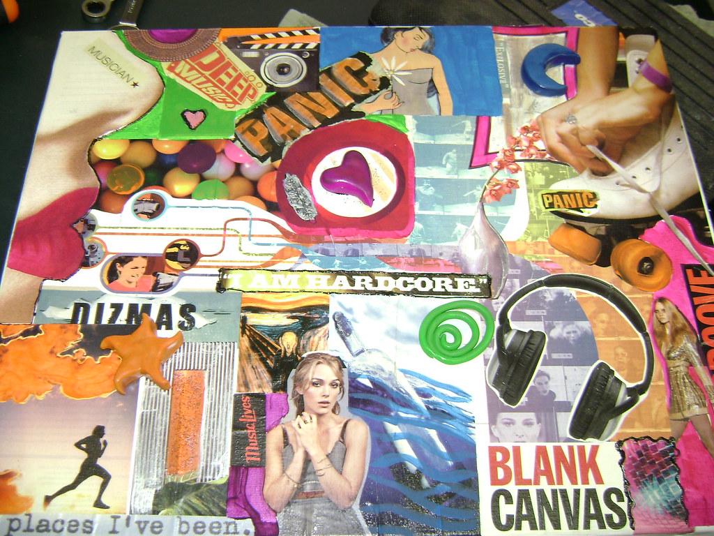
This piece is from my Colour in Context class. We were required to create a regional collage about our birthplace using common colours we found in our own photographs. This collage is about Toronto and I used red, blue, and green as my colours. What I love about this piece of work is that I had the opportunity to use old photographs I took myself in high school. This is probably the most abstract piece of work I have ever created so I was really happy and surprised at how it turned out. The limit on colours forced me to really play with the more abstract characteristics of collages and it also helped me develop my whole idea for this project - that Toronto is a very diverse city and has the best of both worlds with its cityscape and more urban modernization coexisting with nature. That notion led me to the idea of placing rectangular shapes (flat shapes were another requirement) amongst the rocks to represent buildings amongst nature.
REBLOG: COLLAGE
The reblog below is a post by Laura Goodyear. This post really caught my eye as it is vintage in style and equally trendy. It's definitely something I can see myself framing and hanging on my wall.
The fact that all the images are found and true in a realistic form, added more interest along with depth and stories behind these pieces.
-Nata DiBartolomeo
Nostalgia
Hey Guys!
I found this lovely collage artist on Etsy for you all...
Her name is Michelle Caplan. She uses found images and materials from everywhere..
Old photos, wrapping paper, notes, old books...anything!
I love that her work has a history...that every piece has been used before...yet, they can still come together to create something pretty lovely...
http://www.michellecaplan.com/


Best work of Semester

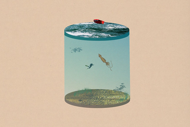
This piece was done for the colour and context class. It was an emotion representation where we had to paint and digitally place the emotion within the art work. I chose this particular one because I am definitely not accustomed to paint as this was a challenge for me. Yes, I admire people who paint however when it comes to my painting skills I don't have the patience for it.
Colour is something that I like and can play around with however in different mediums.
The piece I believe did convey confusion as the theme is depicted in an ocean setting. It shows the boat in the air and the many fish swimming in the sky only to go in many directions. The word "confusion" was strategically placed to portray this projects objectives.
Nata DiBartolomeo
Subscribe to:
Posts (Atom)