Wednesday, November 30, 2011

Video REBLOG

Amanda's OCAD COMDES1 Section 14: Supakitch & Koralie — "something I love" post: SUPAKITCH & KORALIE - VÄRLDSKULTUR MUSEET GÖTEBORG from elr°y on Vimeo .


This video has been added to my favourites list. I think I've rewatched it about 15 x- yet it still never gets boring. I love it because its so aesthetically pleasing, i mean the overall outcome of the little details that it takes to create it. There's a relation to culture- mixed with contemporary styles, using organic lines with bright yet eye-catching colors- to create the movement, kinda art nouveau too. I'm a huge fan of detail oriented art- over an abundance of detail is exciting- especially all that line work. Its like omg- what are they doing- whats it going to look like when they're done- its the wait of the final product.


-VERONICA

Tuesday, November 29, 2011

Yes&No - Reblog

http://comdes114.blogspot.com/2011/10/yes-no.html

I really liked the typographical sculpture Amanda posted a few weeks ago - the one that reads "Yes" in one point of view and "No" in another.  The idea behind it is fantastic and so literal, it's genius.  Simple and effective.

For this reason, I've been thinking about it a lot.

I love sculpture and respect typography.  To see it combined in this play of 2D and 3D space is really, really cool.

This blog was nice because it really helped us all to see things we wouldn't have come across by ourselves.  All our different interests and hobbies came together here.  We got to see art from the eyes of 20 or so other people and it was valuable.  Sometimes it's good to see things outside of your own mind.

Adios, blog.

Leanna.

First Semester's Favourite

Sorry for the quality - this is a picture I took with my computer's web cam so I could show a friend.  The actual piece is with my Colour in Context teacher and I never got the chance to properly scan it.

I really like this artwork because of the freedom we had with the project.  First, we had to pick our favourite picture by our favourite artist and make our own picture drawing inspiration from the chosen piece.  I chose Magritte's 
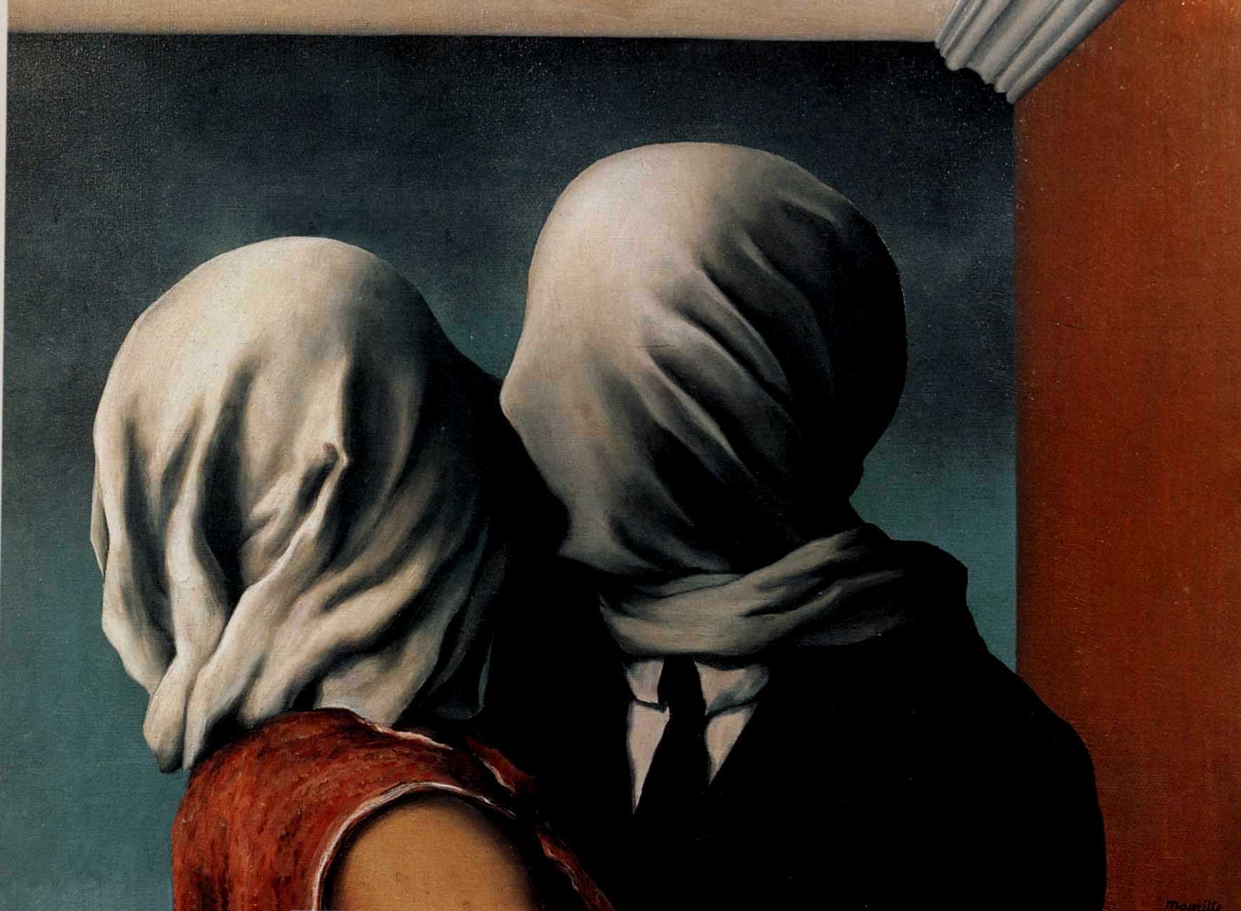
The Kiss as inspiration.  I am a huge fan of surrealism and specifically Magritte (and Dali, but don't get me started.)  The haunting nature of veiled faces was something that I really wanted to dissect.

Another thing we had to do was plan our colour palette.  The one I chose was Saturation Contrast.  In theory, the colour (blue in my case) will pop if it's surrounded by muted colours like greys. I think that sometimes our problem as artists and designers is that we want to use too many colours.  In this project, it really clicked with me that less can be more if used smartly.

Another thing I really liked about this project was that we could choose any media we wanted.  Until this point, all the projects I had done were either in paint or on the computer.  And paint isn't my favourite and computers… they REALLY aren't my favourite.  I like using the good old graphite pencils and pencil crayons.  They are what I grew up using and what I'm comfortable with.  Until this point, I'd been a good sport about trying new things, but I was itching to get back to what I knew.

Saying that, this drawing wasn't easy.  I easily spent over 12 hours shading the fabric folds.  But because I was familiar with the medium, I wanted to push myself with it.  I'm really pleased with how it turned out.

I learnt so much over the course of these few months.  I'm sad to leave this semester behind, but I'm also really excited to continue on, living and learning.

Leanna.


OCAD COMDES1 Section 14: "Iconatomy" by George Chamoun

OCAD COMDES1 Section 14: "Iconatomy" by George Chamoun: George Chamoun's collages are a amazingly seamless blend of two different people, from two different eras, and I feel really expose th...


So, for my reblog, I decided to choose Nicolles post from collage week!
I just absolutely love this piece so much. I find it so intriguing to see how similar societies taste in appearances haven't changed that much over the years. As well as seeing how eerie it is that photographs are taken in almost the same pose as they were several years ago. Whenever I see these images, all I can think is that "the photo doesn't change, but the people in it do."
Just awesome.

Octo-bat!


So, I couldn't really decide what to post. At first I thought of posting my batman drawing that I did a little while before school started, but I thought that it would be too much of a downer, so I wanted to post something colurful and vibrant. Hence, the crazy octopus thing you see before you now.
I wanted to post the batman one because I wanted to show you guys what kind of things I do in my free time, and it's honestly one of my favorite pieces I've done. Mainly because it's done entirely in pencil and took me well over 4 hours to fully finish. I felt really accomplished after finishing it.
As for the Colour Octopus (which was done for my Colour In Context course) I wanted to post this because it was probably one of the projects that took me the longest to do, but felt the most accomplished after finishing it. I really loved the final out come of the project, and the fact that it was almost the cause of my death.

Monday, November 28, 2011

Playing with Bleach

FRONT

So this is my best project so far, not really best best- but it turned out pretty cool. This is more of my favourite just because it had something to do with what i'm interested in, textiles and crafts.
So the whole concept of the assignment was to create money design- My influence was old victorian designs/paisley/rug designs.
I took bleach (yes, the chemical stuff) and drew with calligraphy pens, onto onto brown card stock paper. I consider this as one of my best assignments because of my experimental use of medium- I prefer using different materials, and seeing what the outcomes will be.

-Veronica

BACK

My Favourite Project

This was my favourite project, outside of ComDesign of course because ComDesign was my favourite class. It's the cover and in-pages for my culminating typography project, a booklet comprising my years work in that class.

It is a pretty minimalist, based on the biggest lesson I took away from my typography course - the importance of examining type for its infinite intricacies. Through this concept I created a type based title page that uses the "one" to illustrate a magnifying glass - the O acting as the lens and the NE as the handle. The in-pages are a map of the world formed by type, with the words type is everywhere in the language corresponding to the area.

Thanks for a great semester, Hannah.

This is The End.


So this is my last accumulative post for this semester .My favorite piece of work for the year was from my typography class.This was extremely time consuming and tidieus work for me to do!! I guess that's why it was the most rewarding work and my favorite piece from this term. They were cd covers for a type set containing 4 different types of fonts.

Karen.


Monday, November 7, 2011

expressive type


This ad is for a jazz festival in Portugal...


Not too sure where this ad is from but I thoroughly enjoyed the integration.

This was for a grammy commercial ad, representing the band "ashes to ashes". TBWA Chiat day had created and came up with this concept to incorporate various music bands and lyrics to their songs to make up the poster.

~ Nata DiBartolomeo

Expressive Type Posters

Hey everyone! Sorry for this very late post but I was actually having difficulties with my google account, and yes I just got it going again :)

Here is a very interesting and powerful expressive typography for Broadway poster series. The goal was to create and narrate the story within those posters but without using images. So this really came down to the composition of the texts, the way of projecting emotions as well as a strong bold narrative sense. These posters all struck me with impact because of the movement of the words, both creating attention and hook for the audience's desire to read on.
The art work in the background also offered a unique style, suiting the mood and tone of the poster in relation to the story. I have to say it's simple after all, but quite intriguing and powerful with just what type can achieve and convey!


Hendrix


Expressive Text


For this week's expressive text I thought this image would be most suitable. Its like a collage piece where the artist can pick any images they desire and cut out the letters. Through the selection of images, one can express themselves, easily with the images they have chosen. Whether its chosen based on theme, personality, etc, this type of artwork truly emphasizes on expression.

- Gloria Han

Saturday, November 5, 2011

Type as Image!

Hey all,
So I just, this morning, ventured into the world of tumblr....crazzzzyyyy! And came across some literally killer typography blogs...So I happened upon a blog called "PrettyClever"...and from there linked on to this exceptionally cute video.
   It goes through the alphabet and illustrates a word starting with that letter.. and I think some of them are pretty great! It definitely got me thinking about clever ways of integrating image into type...

Laura :)

Next Blog Assignment

Go to the new blog (you should have received an invitation) for project 3 and follow instructions.

Thursday, November 3, 2011

Expressive, Delicious Typography

lovee this piece, really makes me think of something sweet , kinda like cream soda! theres many variations of this kind of work which im sure u hv seen all over the internet by now.

Wednesday, November 2, 2011

Read your veggies!


So simple.. but well executed and pretty effective. Using objects to create letters is always creative, however I think it is important to note the subject matter and of course not to forgo aesthetic design when using collage to create typography. Here, it is done perfectly, as the artist (e-rok on Flickr) made sure to not forget the elements of what makes good design! This was just done for fun but could easily be an advertisement! 

I find a lot of the time in typography the artist get caught up in the creative use of the words and the overall design suffers, but this is an example that I think works!

Tuesday, November 1, 2011


This is a t-shirt that I saw on WordBoner.com and one that I actually ordered before coming to post this. It uses tracking to express that fact of a too widely open mind.

Expressive Type - minimalism

This advertisement uses a type(pun) of expressive type I find appealing and workable in terms of advertising, my area of interest. It's a very minimalist way of making type expressive, however, no less effective.  Ultimately it emphasizes the power of hierarchy and how small changes, such as boldness of a typeface, can seriously alter the overall appearance and mood of an ad.

Hannah


I always like the text type where there is either a hidden meaning, there can be multiple things that can be seen, or when the font used represents the word itself.
These kinds of things can always either be inspirational, or thought provoking which I always love.

Watch your Language


So with my obsession for wallpaper, i came across this artist named, Tsang Kin Wah- who creates beautiful motifs with text, with these organic shape shifts. His artworks looks beautiful, but when it's looked at closely, one realizes that the language isn't so... friendly....


-Veronica


Typography I found !


Sooo I found two pictures that I really liked, that I thought would relate to expressive type. This first poster I thought was really cool because 3 out of the 4 letters in the 1st and 4th word and 2nd and 5th word are the same and its a really creative way to express a certain opinion. Its being harsh at the same time its also drawing your attention to the type and the meaning behind the words.


The Second image uses different domains to create the world map. The sizes vary depending on how big the country is. I thought this was a cool way to use type in a way that could be both seen as a shape and read as text

Ryan :)