Wednesday, September 28, 2011

Comic Book Geek


Spider-Man; originally drawn by Mark Bagley.

Batman; originally drawn by Bernie Wrightson.
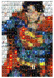
Superman; originally drawn by John Byrne.

All of these were composed by putting together 400 tiles containing different comic covers. Regarding the Superman and Batman compositions, a variety of DC comics were used. For Spider-Man, a variety of Marvel comics were used.
I simply love this. Each composition lacks intense details. I admire the somewhat simplistic approach used in each of these images.
For example, the lack of facial expression in Superman, in my opinion, makes it that much more mysterious, drawing my eye towards it. As well as the intense colours used to express his red, yellow and blue costume.
There's just enough embellishment in certain areas to complete the overall images.
I also love the way the creator was able to utilize the comic books themselves to accomplish the image.

If you would like to get a close up of each image, you can visit this website and just click on which ever images tickles your fancy.

Tuesday, September 27, 2011

Colours for Products

So I'm sure by now at least most of you have heard about how colours have psychological affects on people. For example, red and yellow make people feel hungry, hence fast food restaurants utilizing those colours in their decor/signs, etc.

Red and blue apparently are the most popular for "favourite" coours. While in different places and cultures colours may represent different things, blue is used in packaging/logos/advertising in order to manipulate people to view their product in a certain light... like, I read that it symbolizes things like trustworthiness, reliability, communication, and integrity.

Examples!


Blue Buffalo for your cats and dogs! Because what the heck is corn gluten?


So yes ! I suppose I just wanted to share a bit on that.

Nina

Colours

artist unknown. I found this image really interesting, the colours are so vibrant and popping. Yet the illustration is a bit freaky at the same time, they kind of contrast each other... the colours are bright, colours you'de find in something positive, like happy and fun?...but the illustration weird, demonic and freaky..lol its funny :). This is sick, and it does well for my homework 8).


Colour in a Setting


Sorry about the late post, i'm the world's biggest procrastinator and this totally slipped my mind :( But I chose these images to show how colour can have a huge impact on almost anything and it brings so much to something. This shows how artwork with lots of colour really adds to this restaurant and how it changes the whole look and appeal to it. Plus I also just really love the artwork haha

- Jacklyn B

Jame Jean's Colourful Mind.


This guy, James Jean Is my most favorite artist of all time. I believe he has some of the most intriguing use of colours, and often time he uses two or more colours that are complimentary, Which just happens to be my all time favorite way of using colours because the intensity of an images tends to be higher then if we were going to use monochromatic or analogous colours.  


The Illustrations and prints, James Jean uses are all made of  interesting concepts. No just that he also happens to be the type that can literarily cover every inch of a sketch book and then paint it.  Jame Jeans sketch  book is kind of my goal- to be able to fill every thing in and come up with interesting things. 

Monday, September 26, 2011

Korean food


There are so many things that use color and I think color is the most important element in our lives.

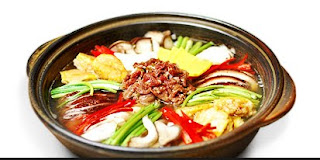
So I have example of object that uses variety of colors, which is food! There are many kinds of foods, however, the color is very important especially in Korean food. Korean people always thought color is important on food. Especially, using bright colors making them harmonized.

I really like the food that is beautifully filled in plates, which pleasants my eyes by looking at it, and it also gives stimulate a person´s appetite. Moreover, I think the meaning of food is not only about taste, but also requested by seeing.

Shabd Alexander for colour.


Designer Shabd Alexander comes to mind when I think of colour. For years before discovering this designer I thought of tie-dye as crafty and fun but not exactly wearable. After seeing Alexander's work however, I was impressed. The tie-dye I once thought of as tacky was now chic. Shabd Alexander experiments with delicate fabrics and interesting colours as she creates a variety of garments and accessories. I would say that the unexpected colour combinations stand out the most in each garment. They just work so well together although they aren't the most conventional or "safe" colours. Alexander's garments are sure to be statement pieces in any one's wardrobe. I, myself, have the backpack in the above photo on the left from her collaboration with BAGGU bags. BAGGU also heavily utilises colours and patterns in their bags so the perfectness in the collaboration was unmistakable.


Snapshot of BAGGU's website


Thanks for reading!

Amanda

Look Up


The Northern Lights are a beautiful and refreshingly natural example of colour for this week's blog. The colours brought to life by Aurora Borealis are nothing short of dazzling. What I see as the most interesting point regarding this light show is the amazing range which can be seen of a single colour. Even more interesting is the fact that such unnatural colours- ones which are not usually seen within nature- are being brought to life by nature itself. The neon greens, pinks, blues, purples and yellows can almost strike an audience as magic or supernatural. 


Wataru Yoshida - My Laboratory


Since this week's post was about colour, I "stumblred" upon amazing illustrations by artist Wataru Yoshida from Tokyo, Japan. What really caught my eye is the level of detail obvious with the meticulous  line work. The main reason why I decided to post this is because I find that it relates to OCADU and the city we live in. 

colour

  1 month ago    1,398 notes    schwetzingen  baden- wurttemberg  heidelberg  germany  europe  park  autumn  fall  bench  peace  pond 
Schwetzingen, Germany
(by Mónica (Monguinhas))

- another beautiful depiction of organic colour... This too is off the tumblr website on a blog called all things Europe. Picture taken in Schwetzingen, Germany

Nata DIBartolomeo

colour

  1 month ago    3,858 notes    italy  tuscany  door  flowers  ivy  old  colors  europe  
Colors- Tuscany, Italy
(by PHOTOBUSTER74)

- I found this photograph on the tmblr website. It was part of a blog regarding anything that has to do with Europe. This particular piece is a hidden door in Tuscany Italy. This piece exudes the organic colour surrounding this  beautiful country. Although the vibrant colours used here I believe to be un-intentional making the only man-made pop would be the blue of the door. The picture holds sincerity in an all around depiction of what colours work best together.

Nata DiBartolomeo

COLOURlovers


I find that I always need colour inspiration, there's just such a huge amount of colours available to our disposal and sometimes its a little difficult to think of unique and fun colour palettes to fit design problems that we encounter.

A friend showed me this website once and I find it works really well when you're in a stump. Filled with patterns, palettes, colours, and articles its always something that's handy to visit!

My favourite section is the "patterns" section, this is a great place to not only get colour inspiration but also design inspiration!

http://www.colourlovers.com/

Sunday, September 25, 2011

Misunderstood


Geishas are artists that people have constantly mistaken with as prostitutes. They perform the classical dance, sing and entertain guests. Truth to be told, they are considered to be extremely respected and hold high authority to the social system in Japan. Colours in their kimonos play an important part to their purpose. As you can see, from the picture above, the farthest right is the eldest out of all of them. The youngsters are more flamboyant and daring with their use of colors.


They are ART, itself. Certain patterns, textures, and combination of colors are picked for vital reasons and with meaning. The different combination of colors and the degree of brightness identifies the ranks of the Geishas. From lowest rank (the starters) wear the brightest of colors and gradually simmers down as they rank higher up.


Maiko


Geiko


- Princess C
* Lovely photos taken by mileston505