Sunday, September 25, 2011

Colour Splashes


I love colour splash photography. I think that it really makes the colour pop out and evoke more emotion than having the entire image completely in colour.
This image definitely gives off a strong sex appeal with the way that the dark red pops out at you. Sure, the image would still give off a sexy feel if it were completely in colour, but with contrasted with the black and white the red shows importance and the viewer's eyes go directly to the dee red first. (Just a little side note: if you ask me, the lips look extremely photoshopped!)
And lastly, I just found this particular colour splash really awesome. I'm attracted to bright colours and well as you see this picture has those! I suppose this also ties in with my texture selection last week with the crazy eyelashes/eye makeups even though this is across the entire face. Once again, I think it would be really cool to have this done to my face!

Julie :)

Mark Ward and his ' color illustrations'


Hey guys ever came across this artist?


Here we have a very interesting illustrator/ graphic designer from London. I researched and did a project on him for one of my art presentation and I can't even start to tell you how incredible his works are with colors. Though the style may seem similar in every piece, the amount of variety and vibrancy in context just speaks for itself!

He utilizes a great selection of mediums from wall mural paintings to aerosol spray painting, printmaking and so much more. His subject matter mixes surrealism with everyday events and symbolism to create fascinating, eye catching works.


Enjoy! Check out the link for other amazing works.


Hendrick


I enjoy the watching the natural colours of the sunset because everytime you watch it, it always looks different =D


Some natural colours I wish I could see one day are the Northern Lights. I've only heard and seen pictures of how beautiful it can be, but I'd really like to see it one day.


I like looking at colours outside during different times and weathers.

I hate being around storms, but I like looking at the colours, especially when the clouds turn from light fluffy greys to dark greys and then the sky turns red-ish purple. It's so pretty ~


Natural colours are my favourite to look at =D

Colour in Motion

I was trying to find something that really had a good representation of colour for this weeks blog entry, and while I was on stumble upon I found this website

Its an interactive colour website that provides the basics on the primary and secondary colours. each colours complimentary colour is stated along with what the colour represents in different countries around the world , and some of its positive and negative traits (the mood the colour can emulate). Another cool feature i found about this is it could be really useful for projects while looking up certain colours to use in a poster. Its made into
an interactive website that I thought was really fun, The movie clips about each colour were also really humorous to watch. This site was really cool and got me interactive and playing around with the site, with I thought was a really good component to this site. It uses simplicity and colour, mixed with a little animation to give all the basic information on the 6 main primary and secondary colours.

Here are some screen shots of the website, but I totally encourage all of you to play around on the website!


Ryan :)

Saturday, September 24, 2011

Where I Noticed Colour this Week (well one of the spots :)

So out and about Toronto this weekend and I saw this great painting in a gallery window and immediately thought about the ComDesign Blog

I love the literally explosive use of colour that really captures your attention then holds it as you try and decide if the painting is jumping out at you or falling into the canvas.
Also (I don't know if this photo does it justice) but there is tons of texture in this piece as well which just works in tandem with the colour and ultimately makes this painting POP!!!

Cheers Hannah

Friday, September 23, 2011

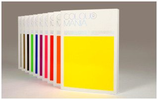
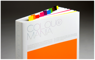
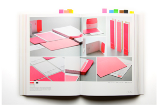
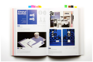
Colour Mania

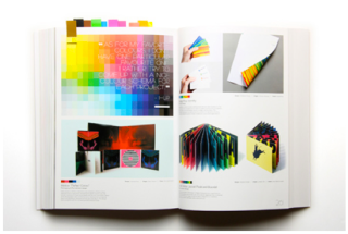
viction:ary is a hong kong based publisher with a wide variety of inspirational design books. Colour Mania is a colour centric book highlighting works by designers in the spectrum. Each section is colour coated with tabs that fold out from the book. FYI: we have this book in the OCAD library. check it out & other books from this publisher : )


Fullbleed Tee's!

One of my favourite illustrators, photographers, and designers is the wonderful Rob Dobi. He is perhaps best known for his illustrations, however, he also has his own line of t shirts under the name "Fullbleed".

He incorporates the colours of the t-shirts into his designs, that often feature a silhouetted figure. Usually there is no gradation and the overall outcome is quite striking.  He also makes prints of many of his designs.


I really appreciate the simplistic approach to colour he uses and that he often takes the medium of fabric into account when making his designs.


-Nicolle. 

Thursday, September 22, 2011

Holi- The Festival of Color


Holi is a festival which is celebrated by people that believe in Hinduism.
  • The festival is celebrated world wide.
  • It is held during the end of the winter season when the full moon ends ( March/February)
  • It is a Celebration of Brotherhood- where one can celebrate regardless of race,sex,cast,creed or status. It does not discriminate. It brings everyone together to be as one.
  • The many different pigments of colour are thrown at one another either in raw powdered form or in coloured water.
I have never been to a celebration like this, I'm not sure if they have one in Toronto, but it is most definitely some thing i would loveeeeee to experience.
Maybe we can organize one at OCAD sometime!? :)

-Karen Lee Roberts

Wednesday, September 21, 2011

Couleurs


Great composition of color from the dress, earrings, lips to the streamers surrounding her. Simplified images, clean lines and rich use of color are all key elements of Patrick Nagel's signature style.

KELLY CHIA
Photo by: Beccy Chittock

I like the look and feel of black and white photos.  Without any colour, it leaves more room for personal interpretation.  Photographers really have to look at what they are photographing, knowing the emphasis is not on colour, and focus on other things like texture, form, etc.  However, what with digital photography, photographers can combine aspects of both colour and black and white photography.  Here, I think it's done beautifully.  

I like that only the bubbles have colour.  I also like that the people behind the bubbles get coloured, as well.  There's a magic to this photo that wouldn't exist if it were just black and white or just colour.  The colour really demands attention in this piece.  It's subtle.  But it works.

Leanna

Bansky


Bansky is a graffiti artist, and political activist in England. He is possibly one of my favourite artists because he is not afraid to push boundries and cause a stir in the media.
I like this piece because of its simplicity. In an area where it's very dark, dingy and filled with browns and greys, Bansky managed to add vibrancy and a little bit of enjoyment in a dull area.
Some speculate that this piece was placed here simply because it's playful, and fun to look at. Others speculate that this is meant to be a statement for freedom, and getting away from petty rules and regulations. Either way, the bright yellow flower catches the viewers eyes and really stands out in this setting.

If you guys would like to check out some of his other stuff(I strongly recommend it) you can go to his website.

Flesh and Acrylic


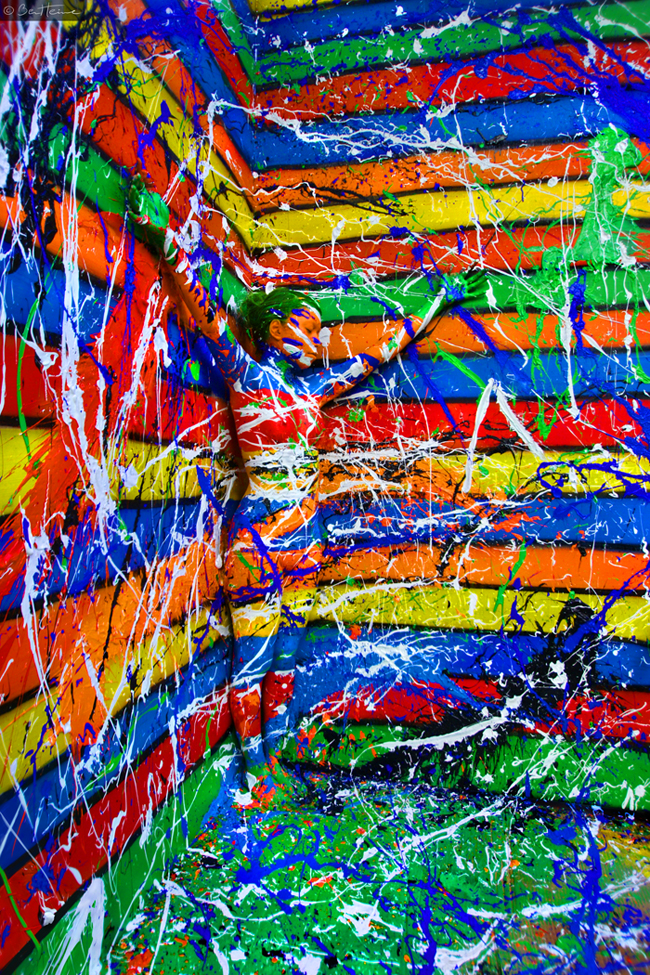
It is very hard not to notice the explosion of colour here. The vibrant nature of the colours are what looks alive in this photograph. It is not until closer inspection that you notice there is in fact a person posed in the corner where the walls intersect. It's great how the horizontal lines of solid, bright colour lead your eye towards the person. It's also brilliant how the model is painted exactly like the background, almost seamlessly blending her into the abyss of colour. I also like how the white paint adds an extra accent to the other colours.

I found this crazy artwork on tumblr, but there was a link leading to the artist's (Ben Heine) deviantart here: http://BenHeine.deviantart.com/art/Flesh-and-Acrylic-C-Madison2-213251582