Created for a magazine cover, this image is what looks like a collage, but is actually all done in front of the camera. The A was created with photography and lighting equipment, and assembled in a way to deceive the eye.
It's amazing how this was all done within the camera, and has an aura of light around the letter creating a border. The simplicity of the background allows the main focus to process, and the image isn't overcrowded. The A seems out of place since it appears to be hovering, and surreal however the subject matter that the A is created from ties it all together.
Communication design seeks to attract, inspire, create desires and motivate people to do or think something using words, images, artifacts, spaces, sound, and movement. Your job is to explore and create original concepts—not merely to emulate others' ideas (although others will inspire you)—and to expand your ideas about what it is to communicate.
Monday, October 10, 2011
Collages

These are some pieces by Derek Gores (an Illustrator and commercial designer) which he made almost entirely by hand-torn recycled and found materials. It amazing how he can find all these found materials to create the right colours for the piece, especially for the skin tone.


These pieces in particular however relate to my last post about colour splashes.

Gores has an excellent eye for finding the right materials for the right tones, tints, and hues that work for the piece. I really admire him for his ability to create the detail that he wants without producing the materials with his own hand and creations.
Julie :)
Sunday, October 9, 2011
Ciertas Historias
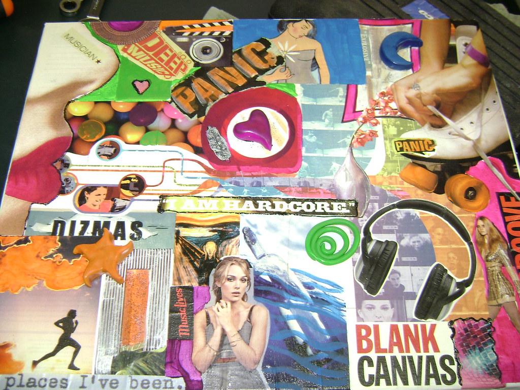
This is a digital collage done by the Flickr user Javier Piragauta, and I found it by browsing through Flickr looking for some interesting collages. He has a whole folder of collages he's done, all of them great, but I found this one to be the best of them all.
There's just a certain whimsical nature to the way it's done, it makes me smile every time I see it.
He's a Spanish artist, so to read the blurb that he wrote, I had to put it through Google Translate, but what he says about this piece is really interesting!
"This is a collage of life, millions of pieces placed one to one by creating a greater whole that is more than a caricature. I have a thousand memories of childhood as the image of Dr. Jose Gregorio Hernandez, my great-grandmother prayed a lot to him to heal the sick and did, filled with herbs to the person and leave them with their prayers as new lol.
Cassette recorders, headphones, type ornaments Louis XV, the famous African are some of the things I saw at that time and now I like to revive the label giving RETRO, I think each and every one of them I have something to say, great is shape them and let them know a little of my life, and have fun watching these crazy haha."
It's a little hard to interpret, but it seems this collage is made from images of his childhood, which a pretty awesome place of inspiration!
Mask
Great image of superimposed railway tracks over a woman's portrait with the tracks leading out where her mouth would be and the railway tunnel following the contour of her face, creating a mask like effect. Like most of his work, John Stezaker expertly fuses appropriated images into collage.
KELLY CHIA
KELLY CHIA
Saturday, October 8, 2011
Hihi~ =D
So this weeks theme was still collage and what I find interesting about the photo's I'm posting is that the items/ photo's used to make the image relate to the person.
Steve Jobs' image is created by using products related to Apple.
The person that made this also has a bunch of other work I find really interesting. They use shapes and colours to relate to the person and the feeling they're trying to get across.
Feel free to check it out ~
http://www.tsevis.com/
For this image it uses multiple images of the same person to create her bigger self, which i thought was really interesting because they would have to be able to find different images to create the tones on her face.
Full of Useless Objects
So this is another artwork that requires having to look closely at, in order to make out what each tiny piece is (film containers, buttons, kids lego, combs, plastic forks, buttons from a keyboard, expiration date tag thingys and etc). I saw this specific artwork at the TIAF (Toronto International Art Fair), quite awhile ago.
One of my favourite collaged works. Within this collaged portrait, there are many little objects that contribute to the outcome of the figure.
- Veronica
catters collage
My grade 9 English teacher condemned my class from ever handing a collage in for a creative assignment, and for some reason ever since I've never thought of how collages could look beyond the teenage binder, Seventeen magazine...sort of thing (Not to bite :(, but I mean something like this). Obviously Ms. Wittlin had never seen collages past those kinds, as well.
I was looking around Flickr for collages for this weeks' post, and that's when I found Guy Catling (catters on flickr). He's not famous or anything I don't think, but more the reason to share his stuff =D
power
lifecylinder
skyrox
handofgod
I like his collages because they're simple, and are able to convey some sort of message without being so inyourface. The collage power was really awesome to me (plus I can't help but giggle at that little rubber ducky--can you see it?), and the pieces like handofgod and skyrox remind me how small we all are in this world... but almost in a reassuring way. If that can make sense to you.
And this one above gave me an idea for my own collage :D
Best
Nina
Critique, please!

Hi everyone! Not so sure if anyone noticed but our poster was missing from last week's class. Though it was unfortunately late, Princess, Nina, Nicholas, and I (Amanda) wanted to post this up for you guys to view and critique. We chose to advertise a latte art workshop with Dark Horse Espresso Bar. In keeping with a their dark colour palette but warm and inviting feel, we went with a simplistic and easy to follow look. We chose to create the latte art in the form of a horse to tie in with their name and even added detail to the end of the word "Worshop" to further emphasize the latte art notion.
If you guys could give us some feedback that would be great. We didn't want to miss out on the critiquing part!
- Princess, Nina, Nicholas, and Amanda
Fantasy/ Reality Montage?
Hey everyone! These are a set of photomontage put together by artist from Netherlands named Mattijin Frassen. He combines real life shot photographs, mixing with his artistic interpretations and vision to create photomontages that reveals aspect of beauty, surrealism as well as reality.
He would first start off with a series of sketches that he has in mind for the overall composition and setting of the scene. Then find the possible and right places to shoot that what tie in with his desired elements. Finally using a couple of software programs and of course much of creativity, compose the final image!
At first glance these may seem simple but because they are combined with real shot images, one will start to question and admire the sense balance of surrealism. I really enjoy photomontages like these because they are quite engaging to both the eye but the mind too.
Hendrick Lau
Friday, October 7, 2011
Face to Face
Collage by Eddie Guy
Originally, I saw this image in a slideshow shown in my Illustrative Concepts class. Since, I haven't been able to get it out of my head. Because the theme of the week is collage, I definately knew which picture I wanted to share with you all!
Straight from Wikipedia, I ripped the definition of collage which is defined as "a work of formal art... made from an assemblage of different forms, thus creating a new form." Thank you Wikipedia! But I did want this definition in everyone's mind as I try to articulate (but more likely ramble) about the amazingness which is Eddie Guy's piece.
It looks simple enough, doesn't it? The composition is simple. The central focal point is typical of portraits. The colour scheme is red and black, tried and true. The concept is simple. He made a face out of faces. But it works. The artwork was made from the assemblage of different forms and other faces to make a new form, a cohesive face, and it's mind blowing the cohesiveness of it all. Simply bananas.
Hope everyone is having a good Thanksgiving weekend!
Leanna
Tuesday, October 4, 2011
Collage, mélange, pegado, kollaasi
“an artistic composition made of various materials (as paper, cloth, or wood) glued on a surface” Miriam Webster
Each of the above images uses one if not numerous techniques of collage, however, despite their extreme variety they all find unity in an element of design that ultimately results in what I find to be extremely effective and appealing artworks.
lets get collaging (that's right collage is now a verb)•
Subscribe to:
Comments (Atom)


