Amanda
Communication design seeks to attract, inspire, create desires and motivate people to do or think something using words, images, artifacts, spaces, sound, and movement. Your job is to explore and create original concepts—not merely to emulate others' ideas (although others will inspire you)—and to expand your ideas about what it is to communicate.
Monday, October 31, 2011
YES & NO
When I heard that the blog topic was expressive type, I thought about all the kinetic poetry I'd seen on youtube. Kinetic poetry is poetry in motion! It's really cool. Usually there is a voiceover of the poem while typography is used as animation to support the spoken word. Sometimes it can be very moving, more so than just hearing the words alone.
There are some really inspiring videos of kinetic poetry out there, but I chose a video that I hope we can all relate to. Please tell me you have seen the movie Zoolander? If not, get on it. Even if it is the definition of a stupid movie, it has some of the best quotes known to man. Winston Churchill is probably jealous.
Anyway, enjoy the video. I really think the motion of the type, as well as the variation of fonts, sizes, and colour help to portray the essence of what Derek is trying to say in this clip of the movie.
Good luck with completing your book covers, everyone!
Leanna.
Sunday, October 30, 2011
Expressive Type
The jacket design for Tana French's novel In the Woods fuses text and imagery to great effect. The haunting beauty of the bare branches captures the dark atmosphere of this psychological thriller.
One Word Poems

Saturday, October 29, 2011
Liquid Type in Motion by Ruslan Khasanov
Maybe you guys have seen this already, but regardless, I'm pretttty sure this man is a genius. Or at least I think he's pretty fantastic. Ruslan Khasanov.
He put together animated gifs/stop motion animations of painted/liquid/evaporating letterforms to create "liquid type in motion" that is lively, eerie, intriguing, and so so dynamic. I know I could go on about its worth as good design/art and how all of those glorious things are achieved, but I'm just going to forget about that and tell you, basically, I'm just really impressed.
From what I've read, Khasanov was at first just creating letterforms using this technique (painting onto a sink and allowing it to run down the drain/emerge with water), and then later created animations of the letters, like this. More here !
Tah-dah.
Nina.
Wednesday, October 26, 2011
the truth is written all over your face
The Bob Marley poster was created by Jason Yan in memory of the artist. The whole image is created from type and features lyrics from the artists' songs. The colourization and the font creates constant movement and direction in the piece. Upon first glimpse of the text "redemption songs", I can hear the melody playing in my head. The composition is extremely effective in the choice of facial expression as well as the selection of words that are enlarged creating a soulful and motivating atmosphere.
The Yoda poster by Olivia Truong is equally as effective. Rather than using black text, the shading and colour is embedded into the type which completely fits the subject matter, and is created with philosophical meaning within Yoda.
Tuesday, October 18, 2011
Please check this blog out
if you need any inspiration or even process help please check this blog out its fabulous !!!
a little inspiration
Ruff Collage
This is what I chose for Collage. I actually don't know who made this piece but it the choices of different material is very interesting. I find that the choice in paper and material kind of builds the feel of the dog. In particularly the mouth area looks like what a dog whiskers and mouth feels like. Plus the background of the dog face seems to match what a the colourations suppose to be.
Tara.
Tuesday, October 11, 2011
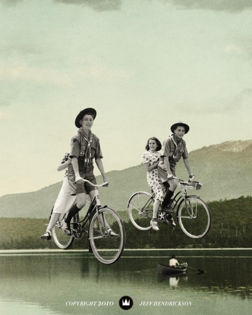
Jeffy Hendrix
At first glance of all his pieces you'll see one large and basic composition- fairly average- and looking as though they are edited old photographs. But after looking a bit deeper one can realize that the bicyclists are moving on top of a lake or a few german children out for lunch are actually giants.
Hendrickson sets himself apart from the chaos of the usual collage work you see out there. He plays with your head a bit and really makes you think with each minimalist piece.
This is something I would like to try for my book cover artwork- keep it simplistic and allow it to leave room for interoperation and thought.